
Providing tools for communities is an important part of our
vision for mO. Information is power, and
it can be used in useful and creative ways to improve life quality, including
reporting environmental hazards, documenting (and reporting in real-time)
violations of environmental regulations, or monitoring of environmental
resources. In this and in subsequent blogs, I will provide some insights into
projects that tapped into such capabilities.
The Natuf Experience
How did mO get to Natuf? Well, we provided pro-bono support
for a UC Berkeley project, a collaborative effort with Bir-Zeit University. The
project is documented here: http://www.ce.berkeley.edu/newsletter/977
Jon Sege from UC Berkeley was the prime mover in this
project. He travelled several times to the region, and established a network of
contacts. I traveled there “by proxy”, meaning, looking around through Jon’s
eyes and listening to his stories. To prove my point, here’s a funny story I
heard from him (I cannot vouch for its accuracy). So one day a local branch of
Starbucks was opened in Ramallah, much to the delight of local residents and
ex-pats. People were queuing to get their fill of latte’ and other types of
designer coffees. Then it turned out that this outlet was not an officially-sanctioned
Starbucks, much to the chagrin of the local aficionados.. who decided to
boycott the Starbucks wannabees.. How was this crisis in a cup of coffee resolved?
The coffee outlet changed its name to Stars and Bucks.. and everyone’s happy
again. I hope we have similarly quick resolutions of the other pending issues
in that troubled area.
OK, back to empowering communities. So there is a detailed
report developed by the joint Bir-Zeit UC Berkeley team. Take a look at it, it
is pretty good (it would be provided upon request, write to me at yoram.rubin at webh2o.net). My favorite part is this figure (see below) that shows how an environmental
hazard is recorded in the field, reported on a mobile app using simple-to-use forms,
and then, with one press on the “Save” button, find its way to the Natuf web
site where it is nicely displayed (geo-tagged, geo-dated, with pictures and notes)
Now, let’s extrapolate a bit. Imagine now dozens of reported
being filed on a given hazard, or a water leak, or a traffic hazard... and a
flag showing how long that hazard has been reported using some sort of a color
code to denote the persistence of the hazard (like green for one day, yellow
for up to one week, and red above that). Now this could translate into some timely
response, right? This approach was not implemented in Natuf, so it is just an idea,
for now. We are waiting for someone to
raise the flag, so to speak (just let us know if you want to give it a try).
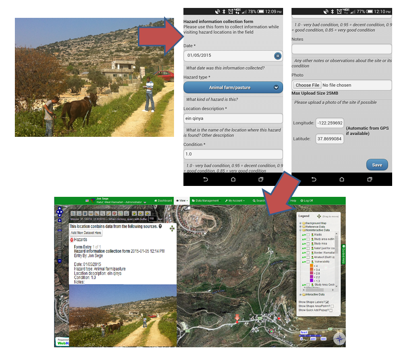 |
In the field, users can collect information on
pollution hazards using a smartphone and upload it directly to the site. The
information will be geotagged using coordinates from the smartphone’s GPS, and
will instantly appear on the map in the location where the user gathered the
information. The images above demonstrate the pollution hazard collection form
for the Natuv risk map. While at the pollution site, the user fills in
prescribed data entry fields to collect all necessary information, and can
include notes and pictures taken at the site. The user then submits these data
directly to the map, where the information appears as a clickable icon.
|
Yoram: I love the story about Stars and Bucks! I wonder if there are any environmental projects state-side that already collect environmental hazard data and might want to try out your idea for changing color icons.
ReplyDeleteAny ideas readers???